work about contact
back to work page

Playfully Rigid

An image of a tabloid with the text 'Playfully Rigid' on the front cover.
A digital mockup of the Playfully Rigid Tabloid.

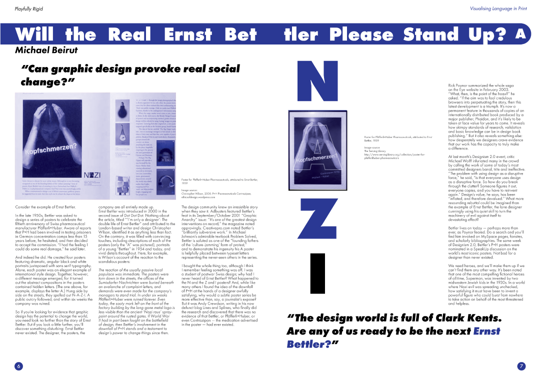
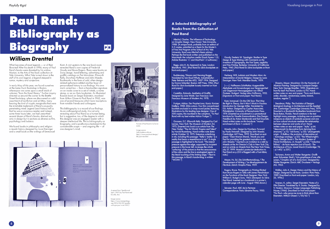
Playfully Rigid is a collection of articles written by members of Design Observer that discuss the history of publication design.


This project was part of a university assignment for Intro to Publication Design. As part of the assignment, we were tasked to create a 16 page tabloid featuring 7 design observer articles using the skills we aquired throughout the semester.

Playfully Rigid Tabloid

Image of the front cover of Playfully Rigid. The text reads 'Playfully Rigid - Visualising Language in Print' and features the article 'The Swiss Grid' by Stephen Heller
The front cover for Playfully Rigid.
An image of the second and third pages of the Playfully Rigid tabloid. It features 6 columns, with a mix of images and text.
Page 2 and 3 of Playfully Rigid.
An image of the fourth and fifth pages of the Playfully Rigid tabloid. It features a title saying 'Face Forward: Fluid Identity and has 6 columns of text and images of tables, grids and hexagons.
Page 4 and 5

Articles featured in Tabloid in order of appearance (Click on a link to read the full article from Design Observer):

The Swiss Grid by Stephen Heller
Face Forward: Fluid Identity by Jason Murdock
Will the Real Ernst Bettler Please Stand Up by Micheal Bierut
Paul Rand: Bibliography as Biography by William Drenttel
A Fine Balance by Erik Spiekermann
Confessions of a Letterhead by Stephen Heller
Ralph Nader: Design Critic by Stephen Heller

An image of the sixth and seventh pages of the Playfully Rigid tabloid. It features a title saying 'Will the Real Ernst Bettler please stand up' and has 6 columns of text and images.
Page 6 and 7
An image of the eigth and nineth pages of the Playfully Rigid tabloid. It features a title on the left page saying 'Paul Rand: Bibilography as Biography' and a deep blue page on the right. The left page features a man standing in front of so artwork.
Page 8 and 9

Project Information

Project for Introduction to Publication Design at RMIT University

- Publication Design

- Logo Design (Playfully Rigid Logo and icons)


Software used:

Adobe InDesign


Futura and Futura Condensed typefaces by Paul Renner >


---


Completed on late October 2020

An image of the tenth and eleventh pages of the Playfully Rigid tabloid. It features a title saying 'A fine balance' and an image of saint peters square with lines dividing it into a grid.
Page 10 and 11
An image of the twelth and thirteenth pages of the Playfully Rigid tabloid. It features a title saying 'Confessions of a Letterhead' and images of letterheads on the top of the page.
Page 12 and 13
An image of the fourteenth and fifteenth pages of the Playfully Rigid tabloid. It features a title saying 'Ralph Nader: Design Critic' and images of the covers of the Sunday Review.
Page 14 and 15
An image of text about Design Observer and Playfully Rigid on a blue background.
The back cover for Playfully Rigid