work about contact
back to work page

Over the Rainbow - Intersect

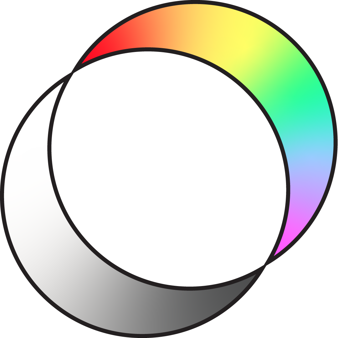
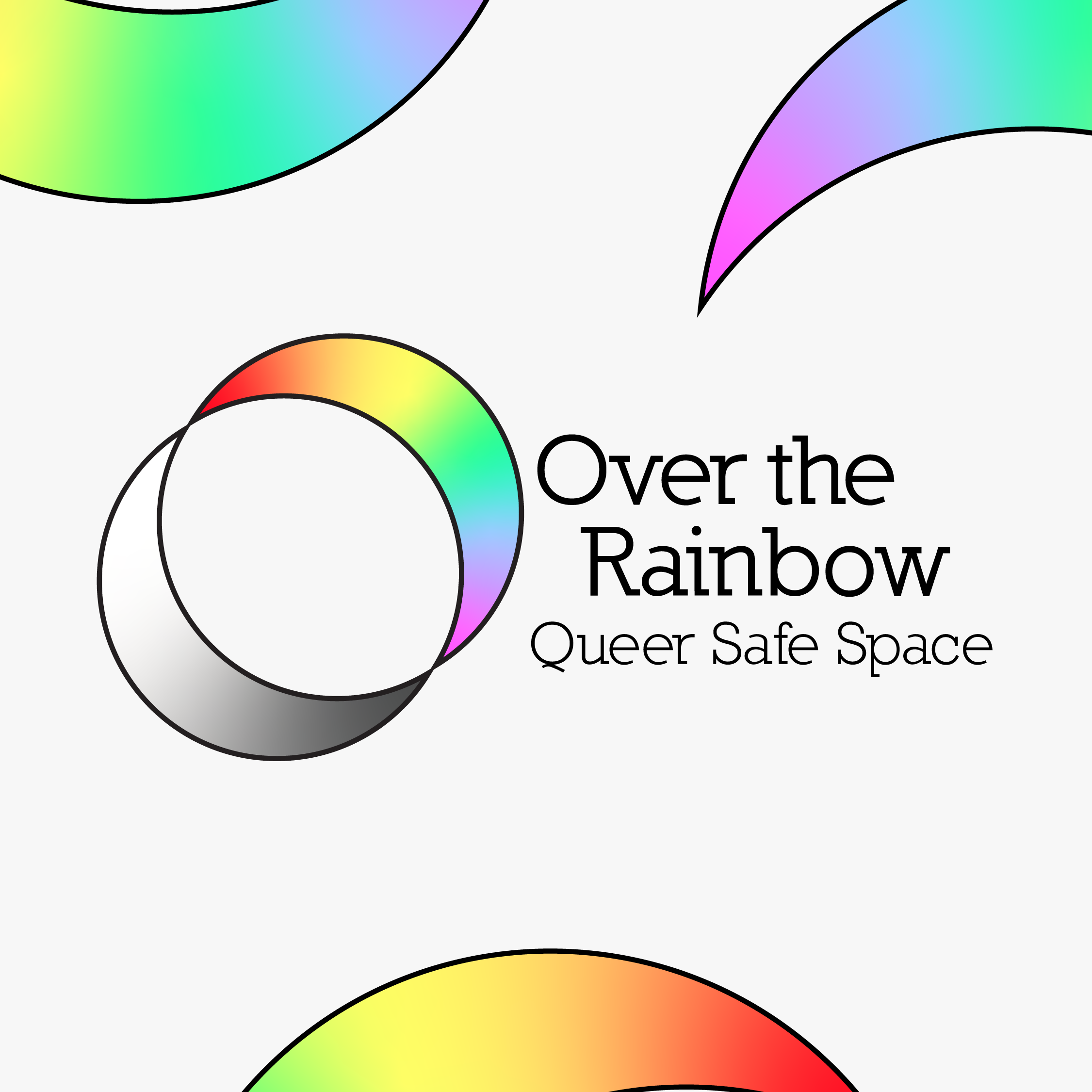
Over the Rainbow started as an idea in 2019 to create a safe space for LGBTQIA+ people in the south east of Melbourne. After a tough 2020 that had put OtR's plans to a hault, they are coming back in 2021 with a new identity.

An image of the Over the Rainbow Logo, consisting of two arcs facing eachother. The top arc has a rainbow gradient whilst the bottom arc has a black and white gradient
The new style logo for Over the Rainbow
An image of a rainbow gradient circle on a white background with the text 'coming soon' beneath the circle
An image of two arcs seperated with one on the left side of the image and one on the right on a white background. The text of the image reads 'Watch this Space'.
Instagram promotional material for the first face-to-face event for Over the Rainbow.
A image of two arcs, one in the top left of the image and one in the bottom right. There is text in the center of the image reading 'It's about time we saw each-other face to face
An image of the the Over the Rainbow Logo with the text 'Over the Rainbow - Queer Safe Space' next to the two arcs

About OtR


Over the Rainbow (also known as OtR in short) is a safe space that is facilitated and curated by queer artists/creatives wanting to connect to chitchat about all things queer.


Project Information

- Logo design

- Branding

- Marketing


Software used:

Adobe illustrator


Nilland Typeface by Manfred Klein >


---


Completed in early 2021